Reworking a grocery app's checkout so people actually finish it.
Role
Lead product designer
Year
2025
Timeline
10 weeks
Client
Basket

Client name
Head of Product, Basket
Checkout took five screens, and most people left on the address and promo steps before they ever saw a total. The goal was simple: fewer steps, no surprises, and a pay button people actually reach.
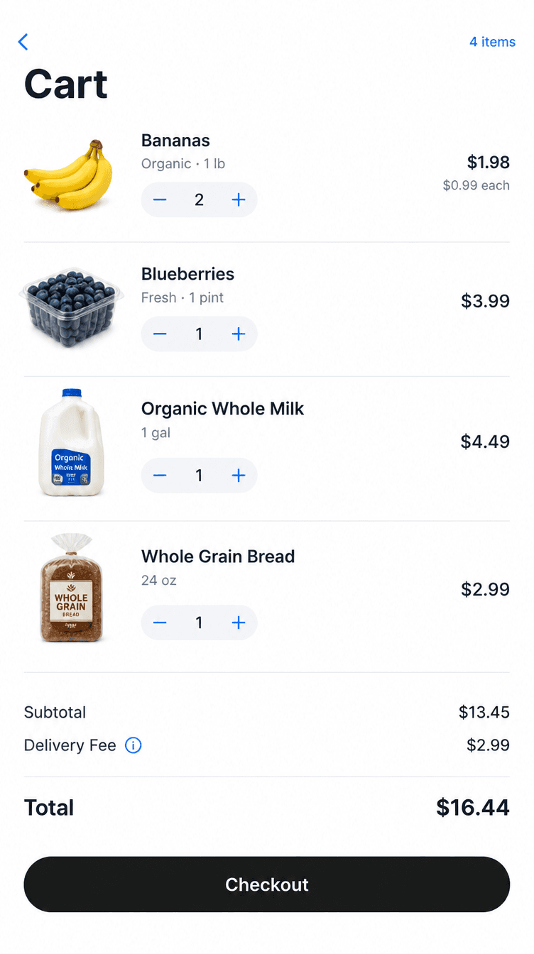
I mapped where people dropped off, then made three changes. Saved addresses arrive prefilled. Promo codes moved into a collapsed row. Fees and the final total show on the cart, so nothing changes at the last screen.

Addresses
Saved once, prefilled after

Promo codes
Tucked into one row

Totals
Shown on the cart, not at the end



Checkout went from five screens to two. Next time, I would test the prefilled address with first-time customers earlier, since we only validated it with returning users.
5 → 2
Checkout screens
+18%
Orders completed
−34s
Time to pay
Open to full-time roles and select freelance work. I reply within two days.
Contact
2026 Maya Ellison